After Dom and I had completed all the screens for the wireframe mockups, we then started working on our high fidelity mock-ups. We first copied over our wireframes and used them as reference for the layout for screen.
I had previously made templates for both the Iphone X and Google Pixel 2 XL, however, we decided against these devices and chose to use the Google Pixel 2 instead. We made this decision because the average user will most likely own a phone with similar specifications and screen dimensions to a Pixel 2.
While developing the brief for our project, Dom and I decided to scheme the apps colours around the Salzburg flag. This meant using Red, Gold and White for elements like our navigation, hyper linked text and buttons. We initially intended on using the specific colour values of the flag, however we opted for softer tones of the three primary colours.


Examples of the colour scheme used within the mockups:
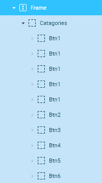
To keep certain elements the exact same in dimensions, colour and placement positions, we used the component feature within Figma. This feature lets you save an element or groups of elements as a master component and gives you the ability to reuse the component again and again to create matching sub-components. You can alter each individual sub component, but changing the original master component affects all the sub-components. This was especially useful in the prototyping phase as when the primary component is linked to another screen, each sub component is then also linked to the screen with the same connection. Using the examples below, once we connected the camera button to the AR camera screen, each subcomponent of the navigation bar was then was linked to the AR camera screen as well. This made prototyping take a lot less time and effort.


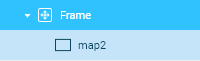
I was a bit more familiar with the prototyping feature in Figma, so I did more of the advanced effects like scrollable content and the moveable map section. To achieve the effect you could only use it on a Frame. To do this you had to press ‘Ctrl + Alt + G’ on a layer or a group. Once this was done, all that was left was to go into the prototype settings and add an overflow behaviour. For the examples below, the map used vertical and horizontal, and the personalize screen just horizontal.


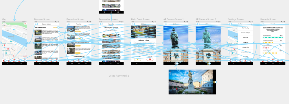
After everything was connected to the according screens, we then had a functioning mockup that behaved like a real mobile application.
THE HIGH FIDELITY PROTOTYPE
The Project File
 Jed's Digital Media Design Blog